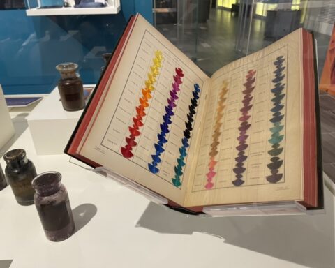
Learning about the ways in which colors seamlessly combine – or clash – is one of the most important things to figure out in a fashion design career. Alas, anyone in a fashion- or fashion-related career should have this step ingrained into one’s mind well before one begins to put out work to be reviewed. If one is a stylist, one needs to know color theory so that one’s clients won’t walk outside looking as if a box of crayons exploded onto their entire form. Media types need to know color theory so that their chosen form of media (whether that be online or print) will be harmonious to the eye. Photographers need to know it so that their photographs won’t be so busy as to make the viewer recoil in horror.
With this in mind, we decided that now would be a great time to review what actually encompasses color theory. First, we will look at a bit of color wheel history. Next, we’ll look at specific items within color theory; afterward, we will discuss the validity of color association.

History Of The Color Wheel
The first iteration of the color wheel was created by Sir Isaac Newton (1643-1727) in the 17th century following his experiments of passing light through prisms; he elaborates on his theory in his book Opticks: or, A Treatise of the Reflexions, Refractions, Inflexions and Colours of Light in 1704. He discovered, among other things, the ROY G BIV (red, orange, yellow, green, blue, indigo, violet) colors of the color spectrum.
Johann Wolfgang von Goethe (1749-1832) published Theory of Colours in 1810 as a nonscientific compendium of study into the ways that color can affect humans on a psychological and emotional level. With his studies as a basis, he created a color wheel.
American artist and professor Albert Munsell (1858-1918) pitched in to add the concepts of color saturation and color value. He wrote multiple books outlining his theories, with one of the more well-known ones being A Color Notation, published in 1905.
These are, of course, only a few of many that have contributed to this vast field, but their work is of particular note in the construction of color theory as we know it today.

Color Theory
The central point of color theory is the color wheel. On the most well-known version of the color wheel, 12 colors (or hues) are assembled according to their wavelength. Colors are broken into three categories:
Primary Colors
Red, yellow, and blue are the three primary colors. These colors can be mixed to get secondary colors.
Secondary Colors
Green, orange, and purple/violet are the three secondary colors.
Tertiary Colors
Blue-green, blue-violet, yellow-green, yellow-orange, red-orange, and red-violet are the six tertiary colors. These colors are the result of mixing primary and secondary colors together.

Color VST
Color VST stands for color value, saturation, and temperature.
Color Value
Color value is the darkness or lightness of a color. Lighter colors are said to be more high value, while darker colors are said to be of lower value.
Color Saturation
Color saturation, or chroma, speaks of the purity/intensity of a color. Decreased saturation leads to a more washed-out look, while Increased saturation begins to look like a more pure color.
Color Temperature
Color temperature refers to the warmth or coolness of a color. Reds, oranges, and yellows are warmer colors, while blues, greens, and purples are cooler colors.

Color Variations
Color Tint
Color tint speaks of mixing white with a color, increasing the color’s lightness.
Color Shade
Color shade refers to mixing black with a color, increasing the darkness of a color.
Color Tone
Color tone is when grey is added to a color.
Color Mute
To mute a color, add its color complement to it. There are other ways to mute colors in addition to this method.

Color Schemes
There are six types of color schemes, or color groupings, that one needs to know in order to create harmonious work.
Complementary
A complementary color scheme is the use of opposite colors on the color wheel. For example, red and green are complementary.
Split Complementary
A split complementary color scheme is the use of a color and the two colors on either side of its color complement. For example, red, yellow-green, and blue-green are split complementary.
Monochromatic
A monochromatic color scheme is the use of one color used with different shades, tints, tones, and mutes
Triadic
A triadic color scheme is the use of three colors spaced evenly apart on the color wheel. For example, red, yellow, and blue are triadic.
Tetradic
A tetradic color scheme is the use of four colors spaced evenly apart on the color wheel. For example, red-orange, red-violet, yellow-green, and blue-green are tetradic.
Analogous
An analogous color scheme is the use of adjacent colors (usually in groupings of three) on the color wheel. For example, red, red-violet, and violet are analogous.

What About The Validity Of Color Associations?
What we are talking about when we discuss color associations is color psychology which, according to the London Image Institute, is “an area of color theory that assigns emotional and psychological connotations between colors and emotions.” Colors are associated with different meanings; for example, red might make one feel feelings of either passion or violence, and blue might make one feel calm and serene.
One thing that it is important to consider when one is deciding whether or not one believes that color theory has any validity is that colors mean different things for different people. Purple may invoke feelings of royalty and wealth in some, while it may bring up feelings of inferiority or shame in others. Why? Because colors in and of themselves have no meaning without the symbolism that we humans put on them. We learn these associations from a very young age, and they are heavily reinforced with both the experiences that we have (both positive and negative) and the external forces regularly suggesting color meanings to us.
Another issue with color association is that different cultures look at different colors in alternate ways. See our previous article on Lunar New Year traditions for a few examples. Many Eastern cultures would cringe with anxiety (and probably do) at seeing those in the West wearing white for one’s wedding day.
Color associations, then, must be taken with a fine grain of salt. It is perfectly fine to use color meanings that have arisen from one’s personal experiences in one’s own life, but we have to remember to not judge others based on the colors that they have chosen for any given situation. Unless those colors truly do clash. In which case, judge away.
To subscribe to Manic Metallic‘s Substack newsletter, click here. To follow us on Bluesky, click here.


